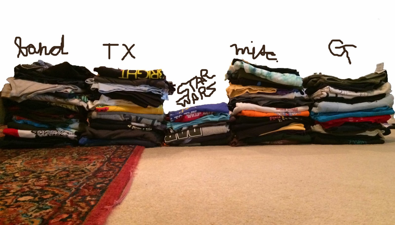
While packing I stacked my t-shirts into a bar graph for science. The shirts are binned into five categories: band t-shirts, Texas themed, Star Wars, miscellaneous, and Georgia Techie. There was a tiny bit of overlap due to Dirk Nowitzki and nuclear engineering Star Wars mashups, but I went ahead and put them in the Star Wars pile seeing as they are contenders for wear on Star Wars Thursdays. Shirts considered for the study are those worn during and after this past school year.
For the curious, I will actually be using my engineering degree to get more degrees. Hullo, grad school. I return to Atlanta this weekend, so hopefully everything will be out of categorical piles and into suitcases and boxes by then. Cross your fingers!
For the curious, I will actually be using my engineering degree to get more degrees. Hullo, grad school. I return to Atlanta this weekend, so hopefully everything will be out of categorical piles and into suitcases and boxes by then. Cross your fingers!


I'm having trouble reading the data.
ReplyDeleteCan you re-do it using box-and-whisker?
Maybe a 3d scatter plot: [likelihood of wear] -vs- [day of week] -vs- [amount of time already having been worn]
I'm feeling an HMM coming on...
When the clairely molly budget allows for a data analyst I am hitting you up.
Delete(unless you accept photoshopped pictures as payment, in which case I can hire you on the spot)